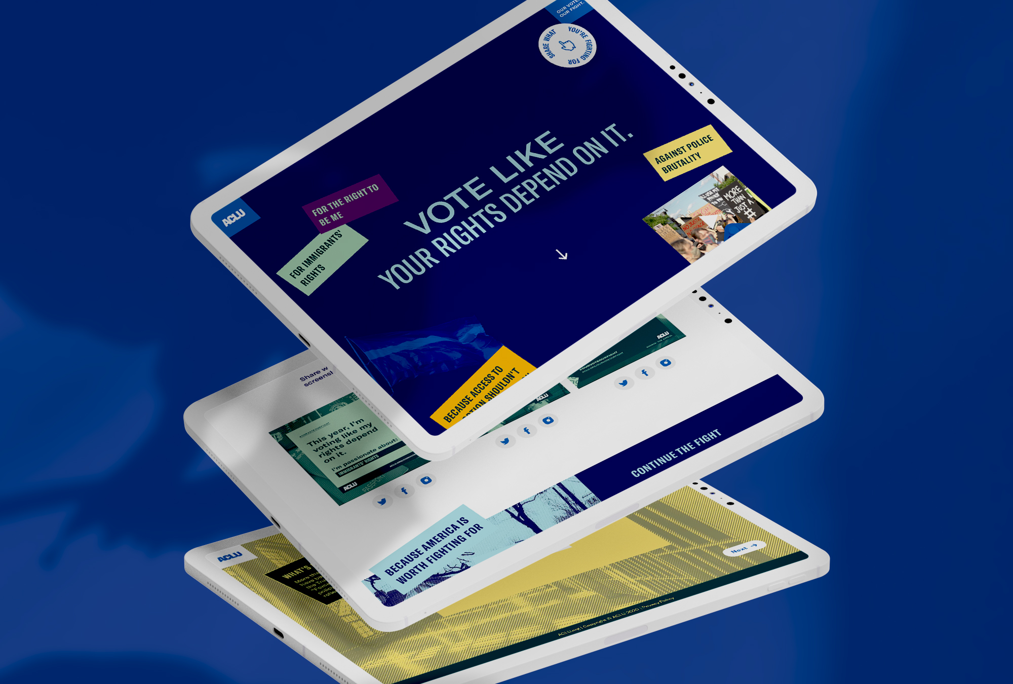
ACLU PRESIDENTIAL ELECTION ISSUES GENERATOR
Design Direction Campaign Strategy
Design Direction Campaign Strategy
Design Direction Campaign Strategy

▾ The Project
One of the ACLU’s mission is to provide knowledge and to turn that knowledge into action and power. Our goal was to leverage the ACLU’s expansive data and statistics around American society and distribute it in personal and impactful ways to encourage voting during the 2019 presidential elections.
Core to our belief systems are the issues that govern our society. When we vote, we vote for the access to change laws and put into action systems that will empower and protect.

▾ Project Phases
Planning →
REPOSITIONING →
Mapping out meanignful ways to distribute ifnormation and compel voting
Experience →
Brand House →
Determining how users will interact with and ultimately share the data
Execution →
Identity Refresh →
Defining the system and how the data tracks against the system
Roll Out →
Brand System →
Launching the website and brand assets to raise awareness
▾ Goals + Objectives
① Provide the most pressing and urgent statistics across the issue areas ② Make the experience about the issues by using design primarily as a way to visually connect hierarchy and information ③ Empower agency over the experience and sharing of materials through providing natural channels to participants ④ Drive voter turnout through understanding the issues and their impact across the election.
▾ The Experience
Reaching our audience
Our goal was to create a campaign truly focusing on the issues that matter most to voters and providing information about how those issues can be addressed by particular parties and specific candidates. We also knew that we wanted voters to be able to share that information back out to a wider audience. We knew that using ACLU’s massive database of statistics would be a great way to help disseminate particular sets of data around the 14 areas ACLU focuses on. This helped us to focus on creating an experience around participants drilling down into specific issue areas and receiving statistics that they could share.
Disseminating the issues
With America’s numerous ongoing crises across the 14 issue areas, we wanted to ensure that participants would be able to get statistics that specifically spoke to the areas they were most concerned about. We also wanted to ensure that there would be visual cues to allow participants to understand their way through the journey and to help viewers know that there was a bevvy of results being populated and then shared.
Experience mapping
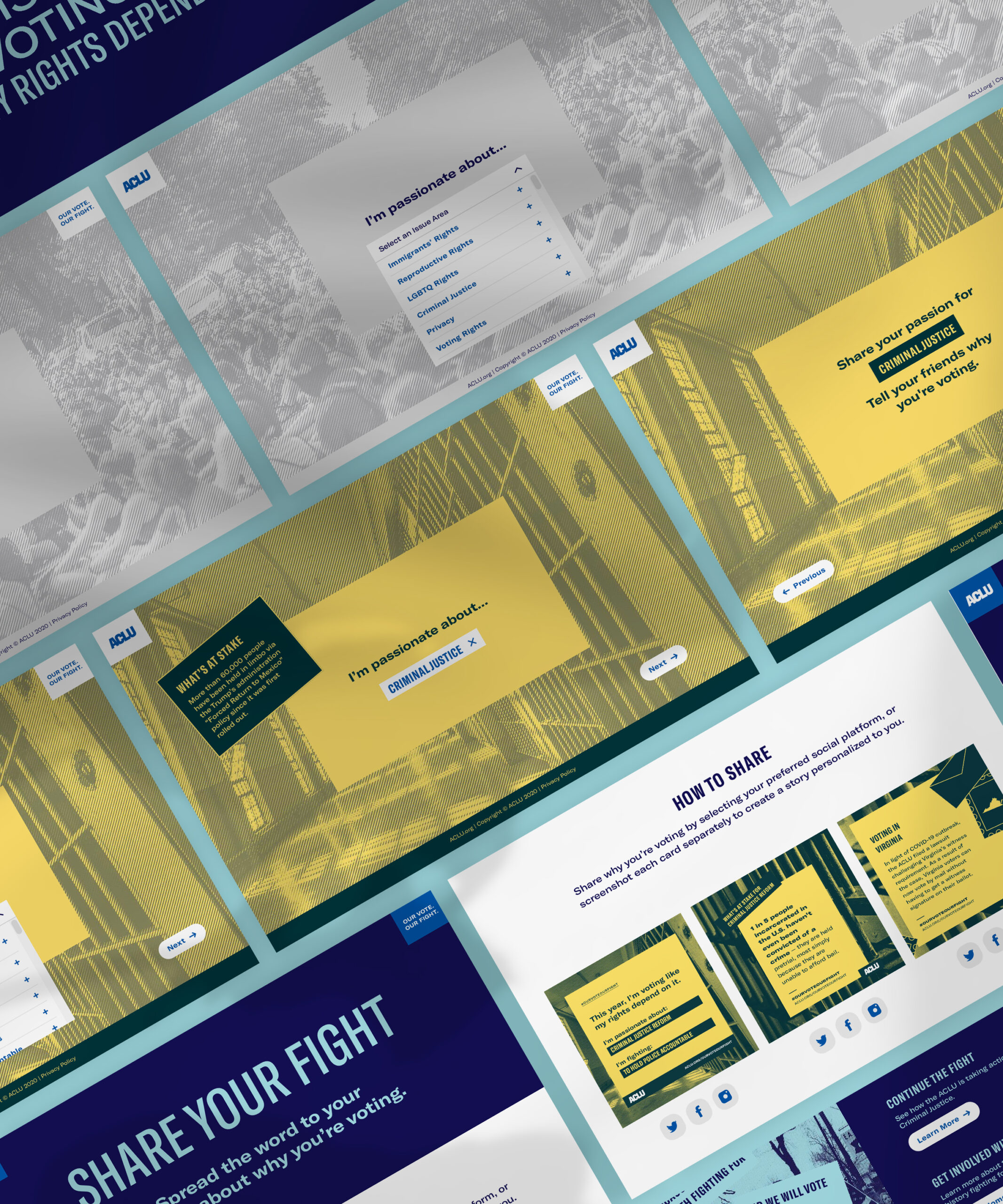
The microsite journey + share process was designed to support participants easily getting the data points they were looking for based on their unique interests. It was also designed to ensure ease of sharing and allowing participants to decide what to do with the data points they uncovered.

Issues areas
To holistically build in visual navigation and and hierarchy across the 14 issue areas, and to ensure participants were able to visually connect the different colours based on choice and across the issues, we turned to the ACLU’s colour palette which is dynamic, carefully charted, and offers a wide range of accessible colour combinations.
We determined a primary and secondary for each issue area, and then coded across the experience how these 2-tone colour combinations appeared, both in design and across ACLU’s signature modern engraving treatment for photography.
Issue areas
To holistically build in visual navigation and and hierarchy across the 14 issue areas, and to ensure participants were able to visually connect the different colours based on choice and across the issues, we turned to the ACLU’s colour palette which is dynamic, carefully charted, and offers a wide range of accessible colour combinations.
We determined a primary and secondary for each issue area, and then coded across the experience how these 2-tone colour combinations appeared, both in design and across ACLU’s signature modern engraving treatment for photography.

Issue Areas and Colour Ways
Over 1,000 assets created
The first share card represents 14 areas and unique reasons to fight for those issues for a total of 81 cards created. The second share card represents 10 statistics per issue, making a total of 140 cards created.
The third share card represents 1 voting fact per state, colour coded for each issue against 56 areas of the United States (including States, US Territories, and the United States as an entity), for a total of 784 cards created.
Art Direction and Visual Design by Faith Kaufman ✓ Motion and Video Design by Wen-Chi Huang ✓ Development by Eleven Zero ✓ Production by Camille Ross ✓ Strategy by Sophie Locke and Tessa Jane Kalinosky