ESQUIRE BRAND IDENTITY
Design Direction Photo Video Motion Site Experience
Design Direction Photo Video Motion Site Experience
Design Direction Photo Video Motion Site Experience

▾ Introduction
Much of the consideration around Esquire's digital identity was based on impact and creating a strong visual aesthetic. Esquire.com's editorial voice is unique and active – engaging in everything from politics to current fashion trends. They do not shy away from controversy, taking on heavier topics, and showcasing a wide breadth of humour, sincerity, and trendiness.
To match the editorial tone, research began with focusing on foundries creating dynamic and large typefaces – fonts to really make a statement editorially. For color palette, we looked to the past – old race cars, mid-century modernism, and notes of the 1960s renaissance of Esquire (such as the iconic Warhol cover). For site design and UI, we went large and bold – vibrant color blocks, large type, and card-styled hierarchy.
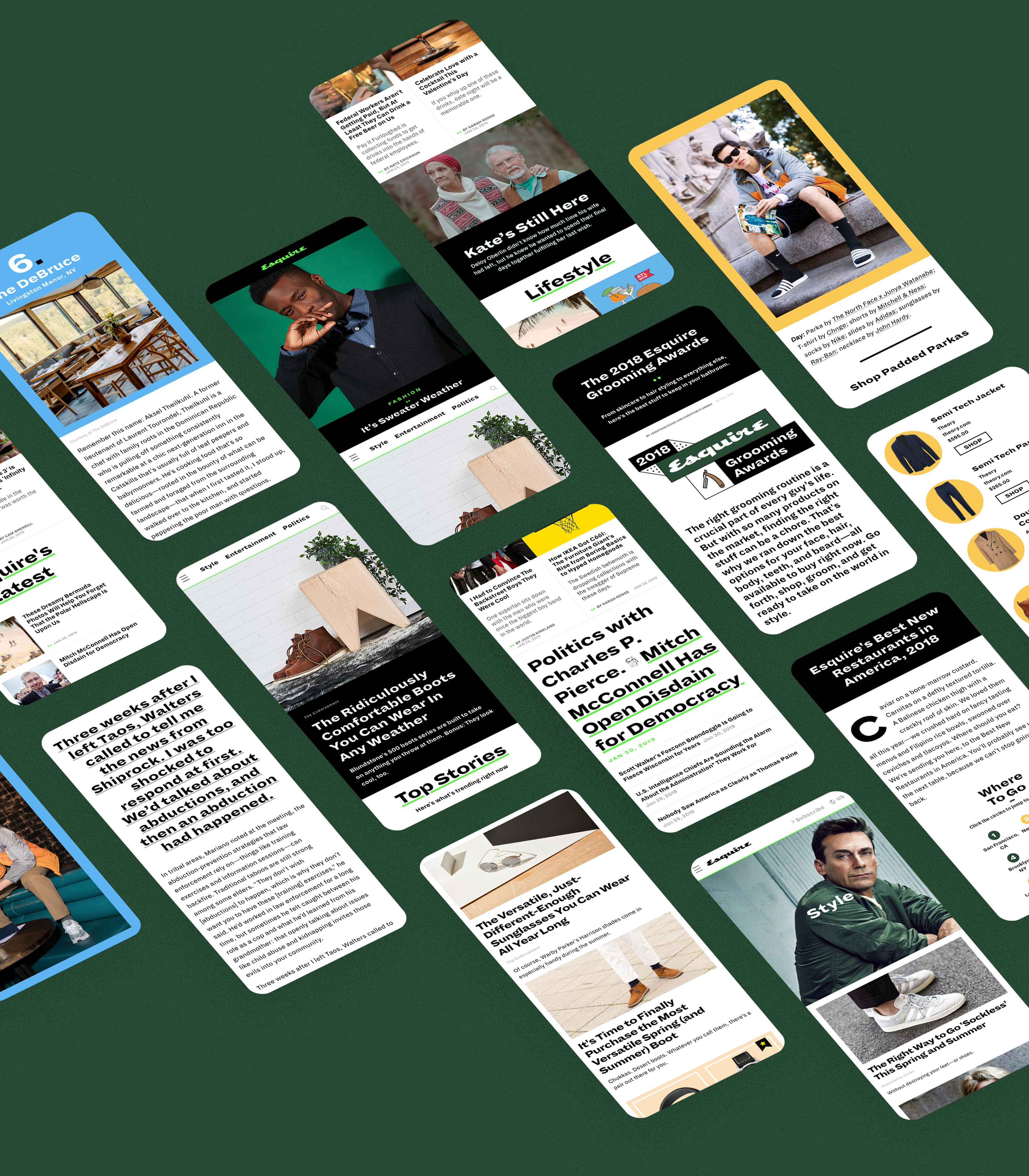
Kyle MacLachlan by Sofia & Mauro
Esquire shot a profile on Kyle MacLachlan upon the 20th annivesary of Twin Peaks, which relaunched a third season in 2017. Embracing MacLachlan's Agent Dale Cooper's dark turn, the concept was purely devoted by a Fire Walk With Me spin. Shot in Brooklyn, a stunt double was used to create two fully-shot series frame-by-frame movements of both the double and Kyle and then composited over a series of 60 frames.
▾ Typography
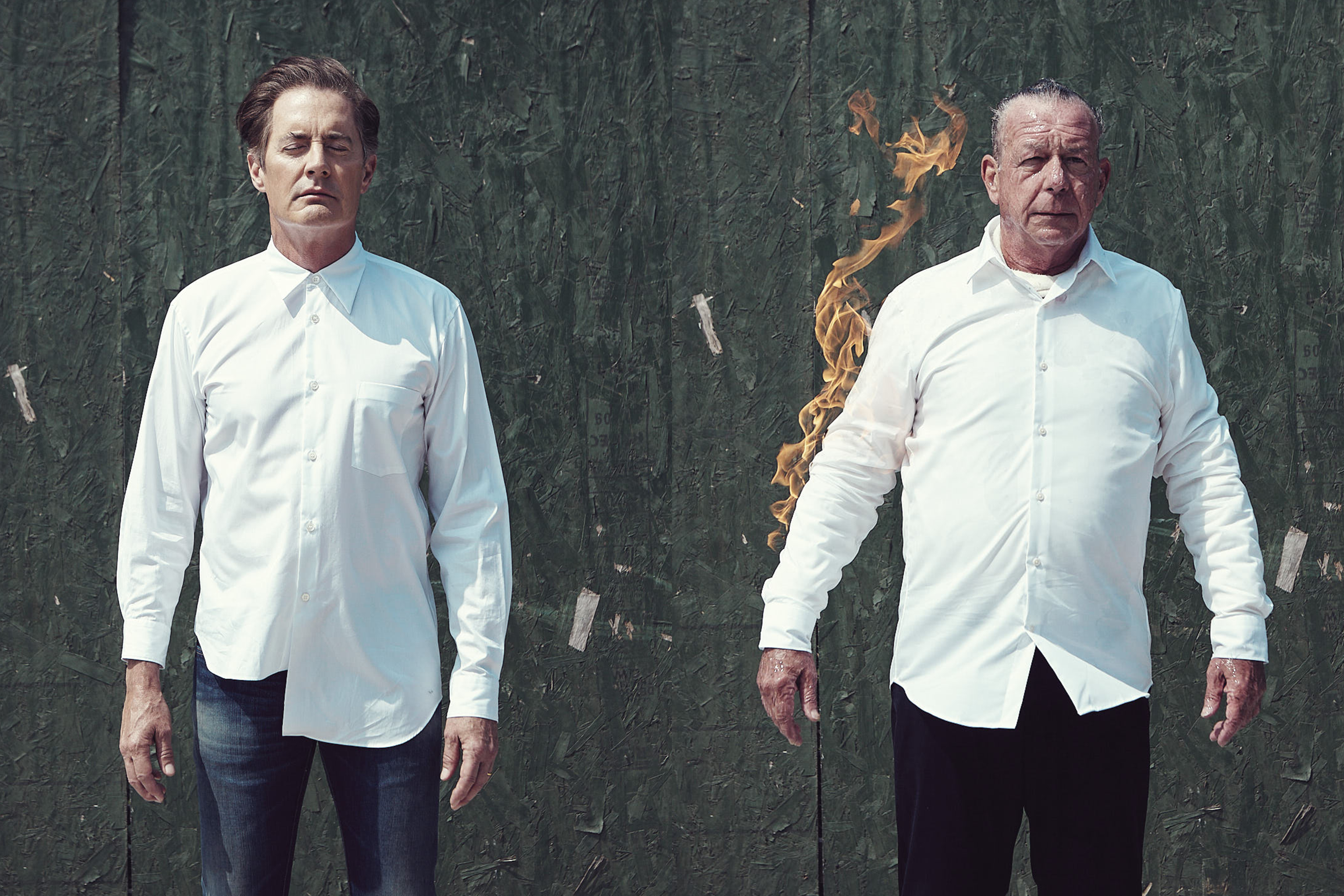
Dia, by Schick Toikka, was chosen for its individualistic personality and wide-width display aesthetic. Modern, but approachable, it brings buoyancy to Esquire's editorial voice and allows its type moments to be bold.
▾ Colour Palette
01
Neon Green
93-237-70
02
Forest Green
48-74-55
03
Emerald Green
48-74-55
04
Racecar Red
252-70-72
05
Racecar Blue
98-180-236
06
Racecar Orange
249-209-86
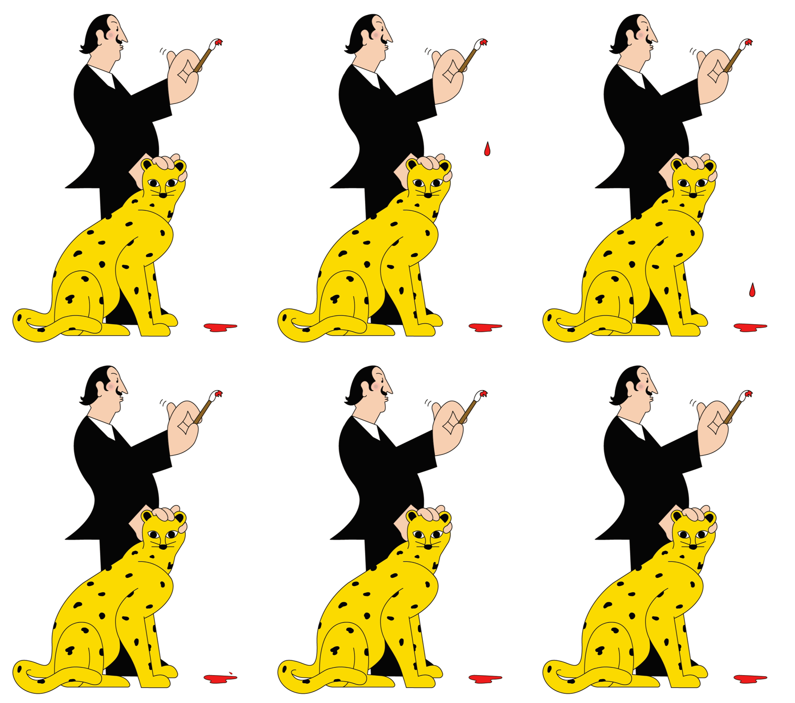
The Great Rikers Island Art Heist
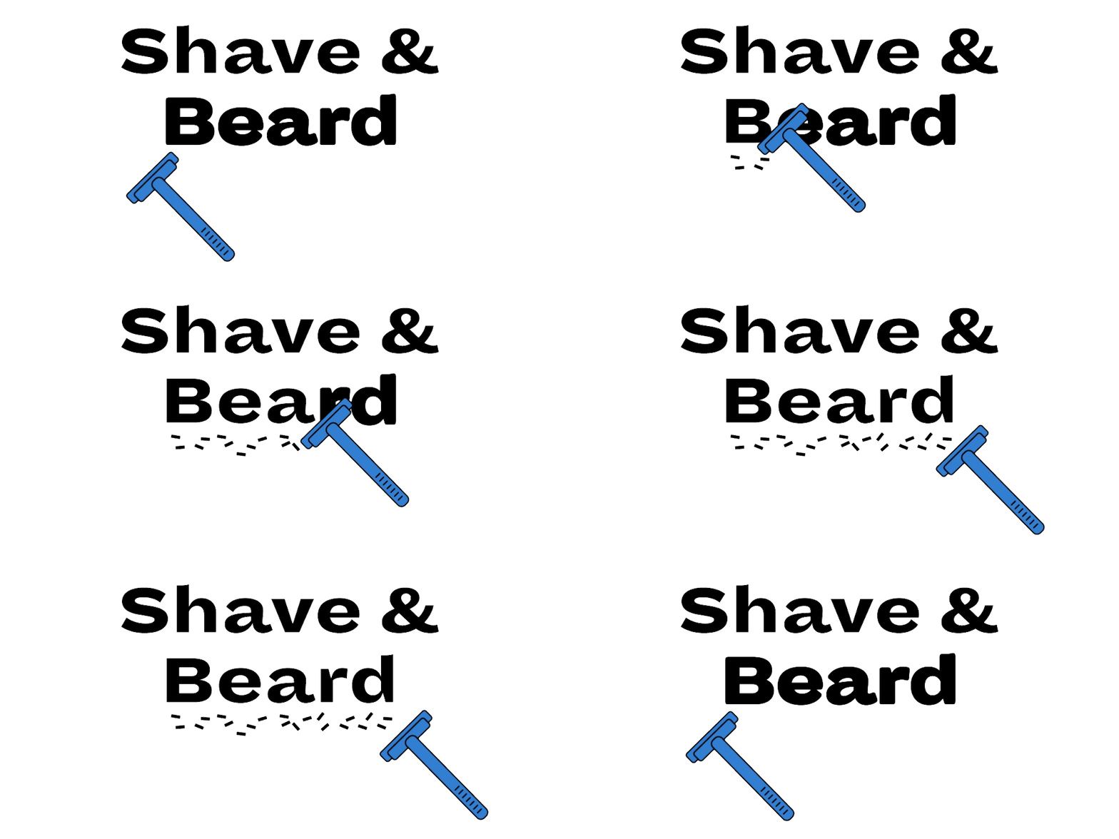
In 1965, Salvador Dali provided a painting to Rikers Island for an inmate art day. In 2013, after years of Dali's piece being floated around and all but forgotten, several inmates and a guard attempt to steal the painting. Bastidas was commissioned to create playful and inventive illustration, showcasing the story's absdurity and capturing the parallels between the Dali aesthetic and the ensuing madness of the case.
Illustrated by Igor Bastidas
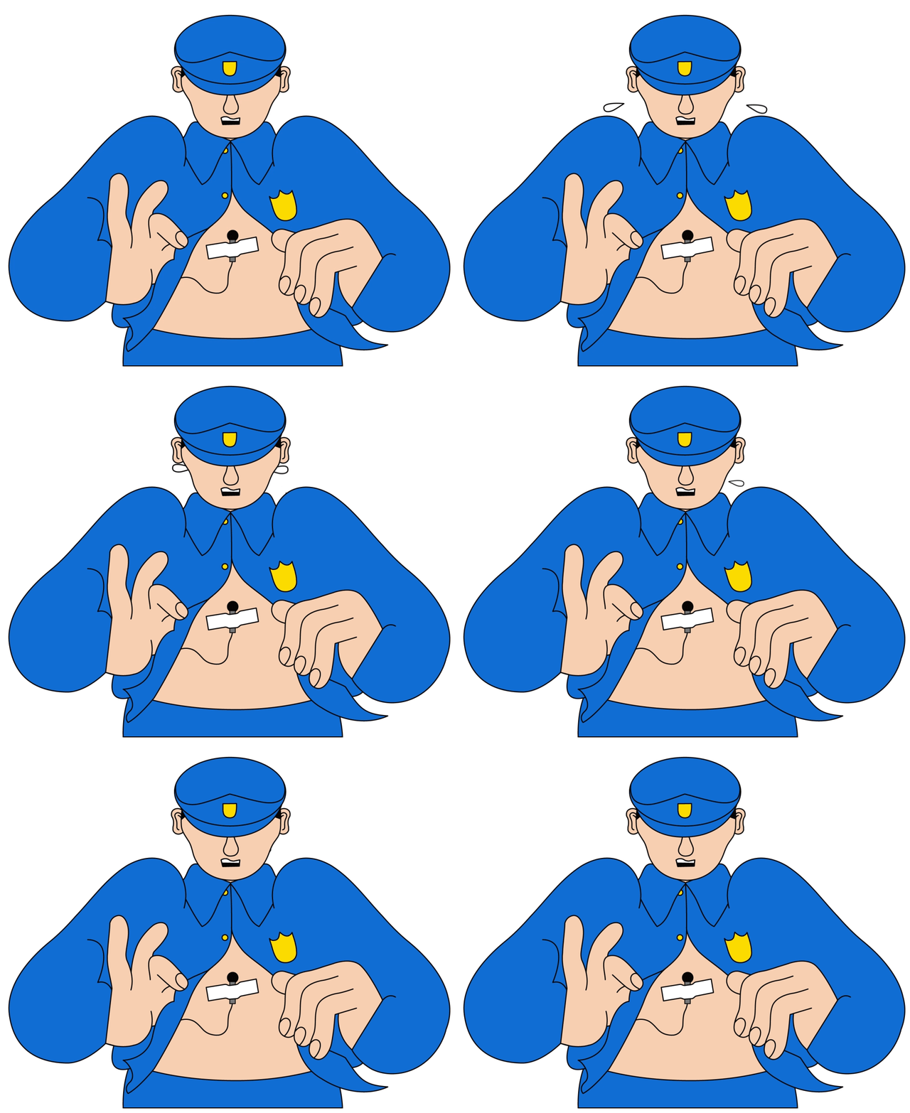
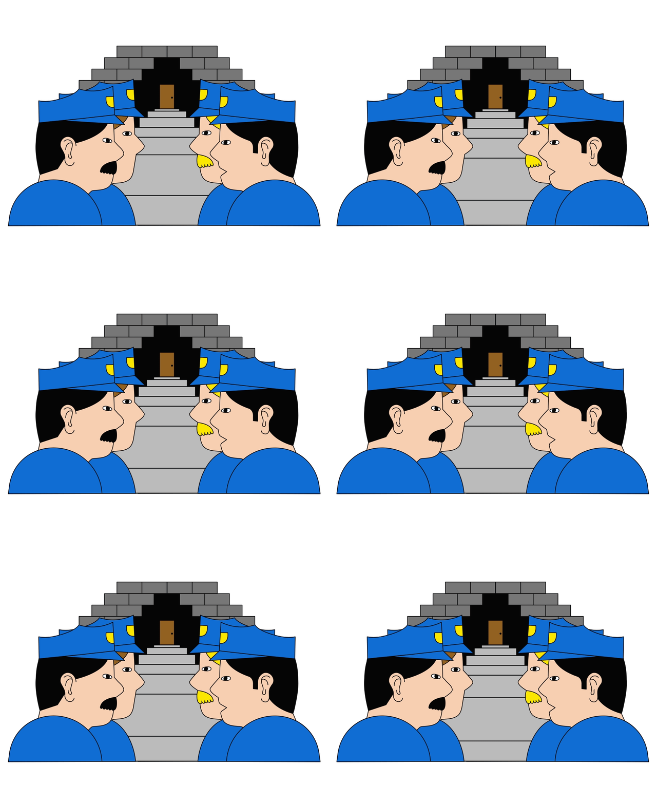
How to tie a tie
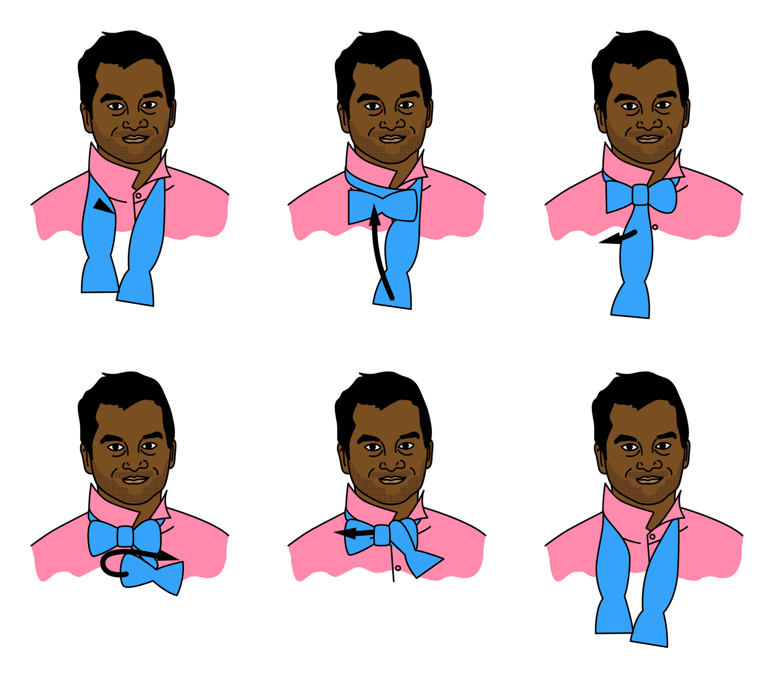
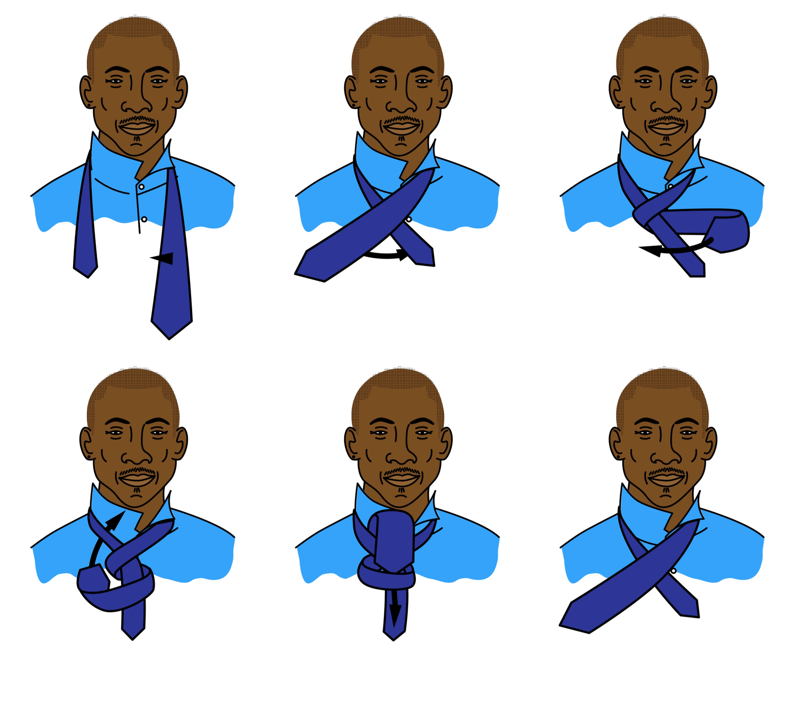
One of Esquire's most highly-searched pieces of content, How to Tie a Tie shows how to tie 6 different styles: Full Windsor, Half Windsor, Four In Hand, Simple Knot, and Bow Tie.
Abranowicz's commission included illustrated & animated step-by-step instructions of how to tie each style of tie, making the steps fun, clear, and easily digestible with the illustrator's fun and approachable style.
Illustrated by Zander Abranowicz

Visual Design by Mike Kim ♪ Motion by Hayeon Kim & Cameron Sherrill ♪ Creative Direction by Nick Neubeck ♪ Front End Design + Development by Artem Artemov ♪ Production by Sarah Kalagvano