HARPER'S BAZAAR BRAND IDENTITY
Design Direction Motion Site Experience
Design Direction Motion Site Experience
Design Direction Motion Site Experience
▾ Introduction
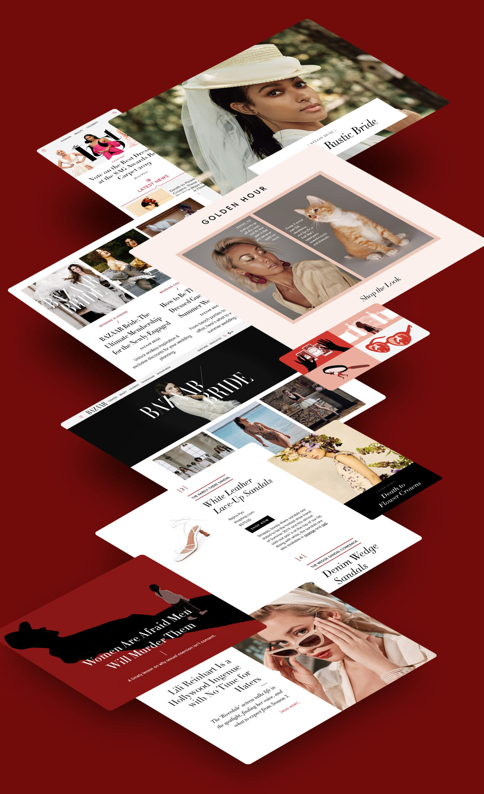
Built on sophistication, chicness, and prestige, Harper's Bazaar is a staple of the fashion world. Though its 100 year legacy is tried and true in the fashion world, the digital wing of its franchise leans more into the pulse of the modern age – reporting not only on fashion, but on current events and celebrity news, lifestyle, bridal, and a heavier branch of op-ed and long format, heavy-hitting editorial surrounding women's issues.
In guiding the brand toward this plugged-in point of view, re-evalulating what makes the brand successful was important – its iconic photography and use of experimental type by using Didot are key components of the brand. Finding a color palette that felt enriching to its staple red was important, as was franchising that palette to different sects of the brand. A new font was chosen to give Didot a natural ally, and the website was re-designed to give Bazaar an airy, plotted, and elegant accessibility.
CLIENT
Hearst
ROLE
Design Director
▾ Typography
In an effort to modernize Bazaar's iconic presence – and translate it into a clean and legible web experience – Harmonia Sans, by Monotype, was chosen to help balance the delicate and precise nature of Didot with Harmonia's streamlined and clean look. Systemizing Harmonia's use with a light weight for statement type and bold for tags and labels, Harmonia is able to seamlessly merge into Bazaar's presence and give its staple type, Didot, room to breathe.
01
Salmon
247-203-179
02
Medium Red
164-33-26
03
Harper's Red
234-53-36
04
Black
0-0-0
05
White
255-255-255
06
Dark Red
103-24-19
Opinion editorial
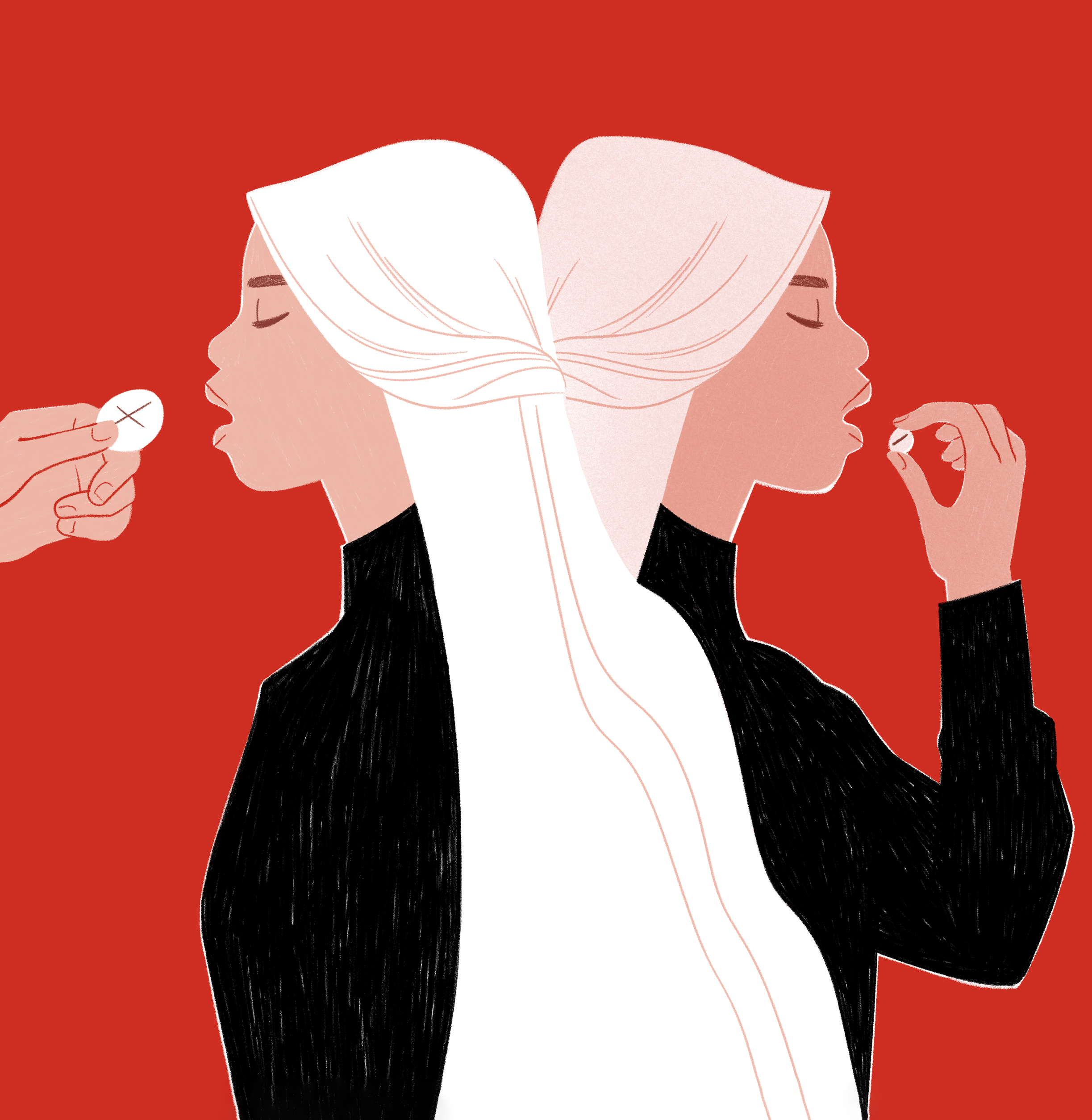
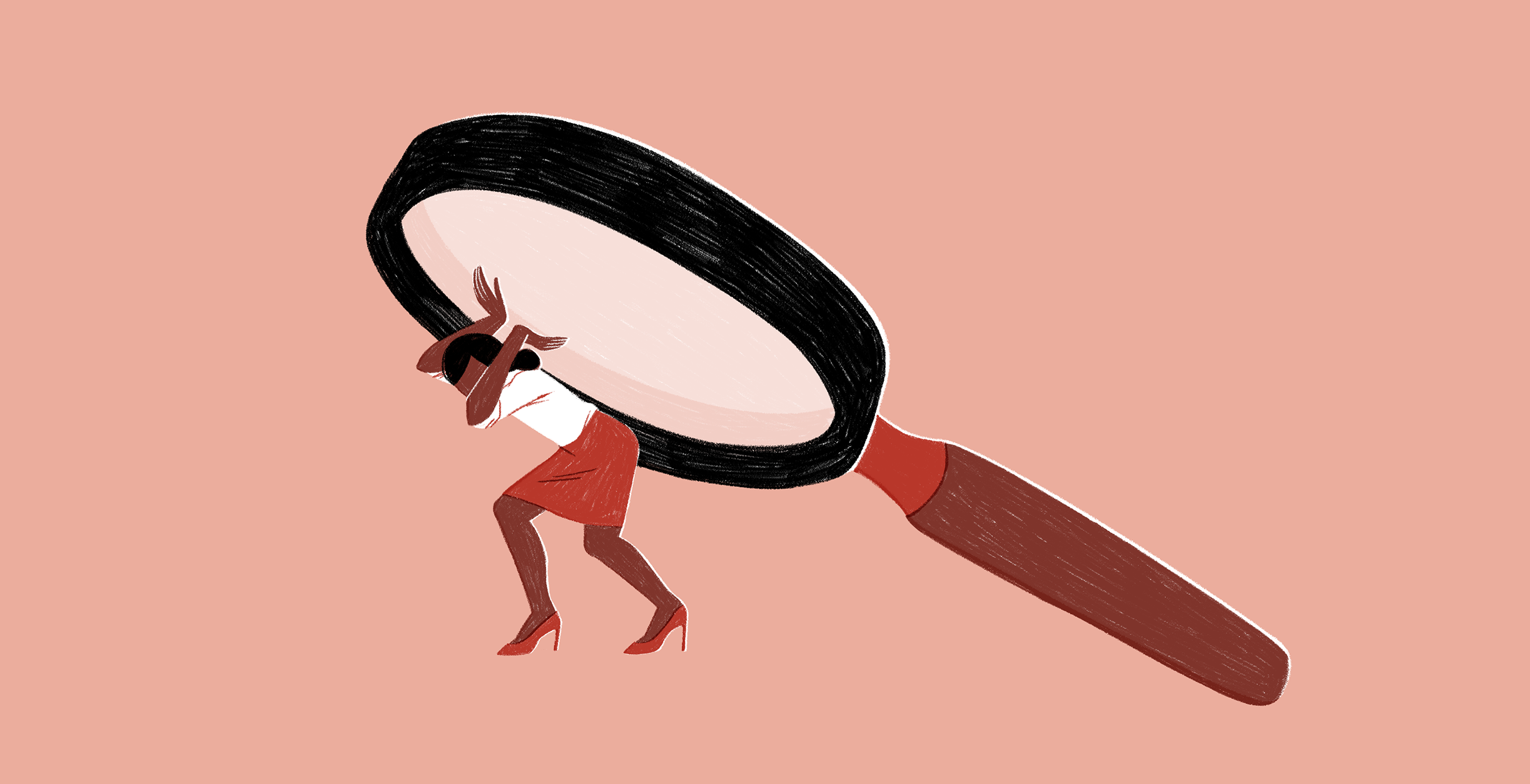
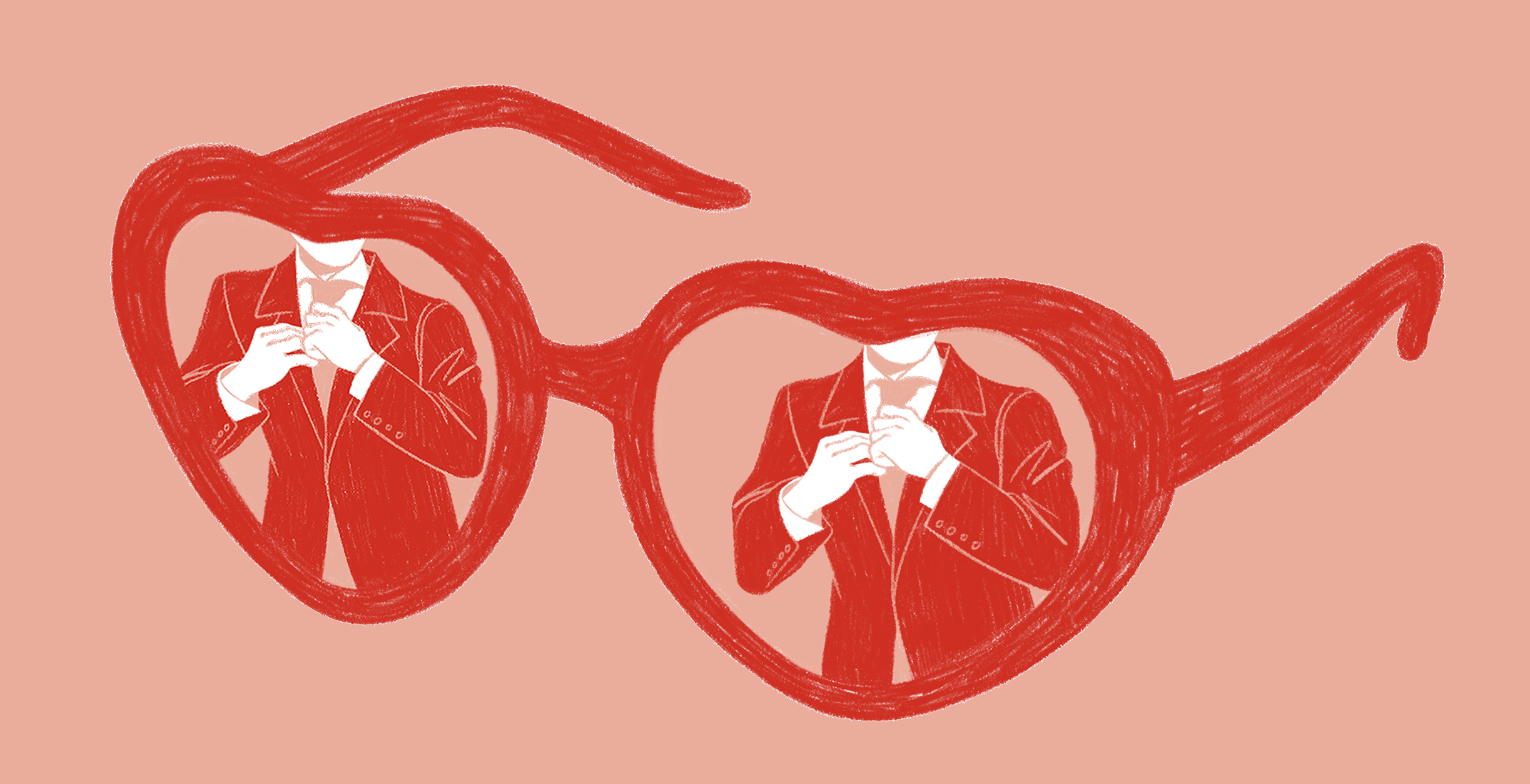
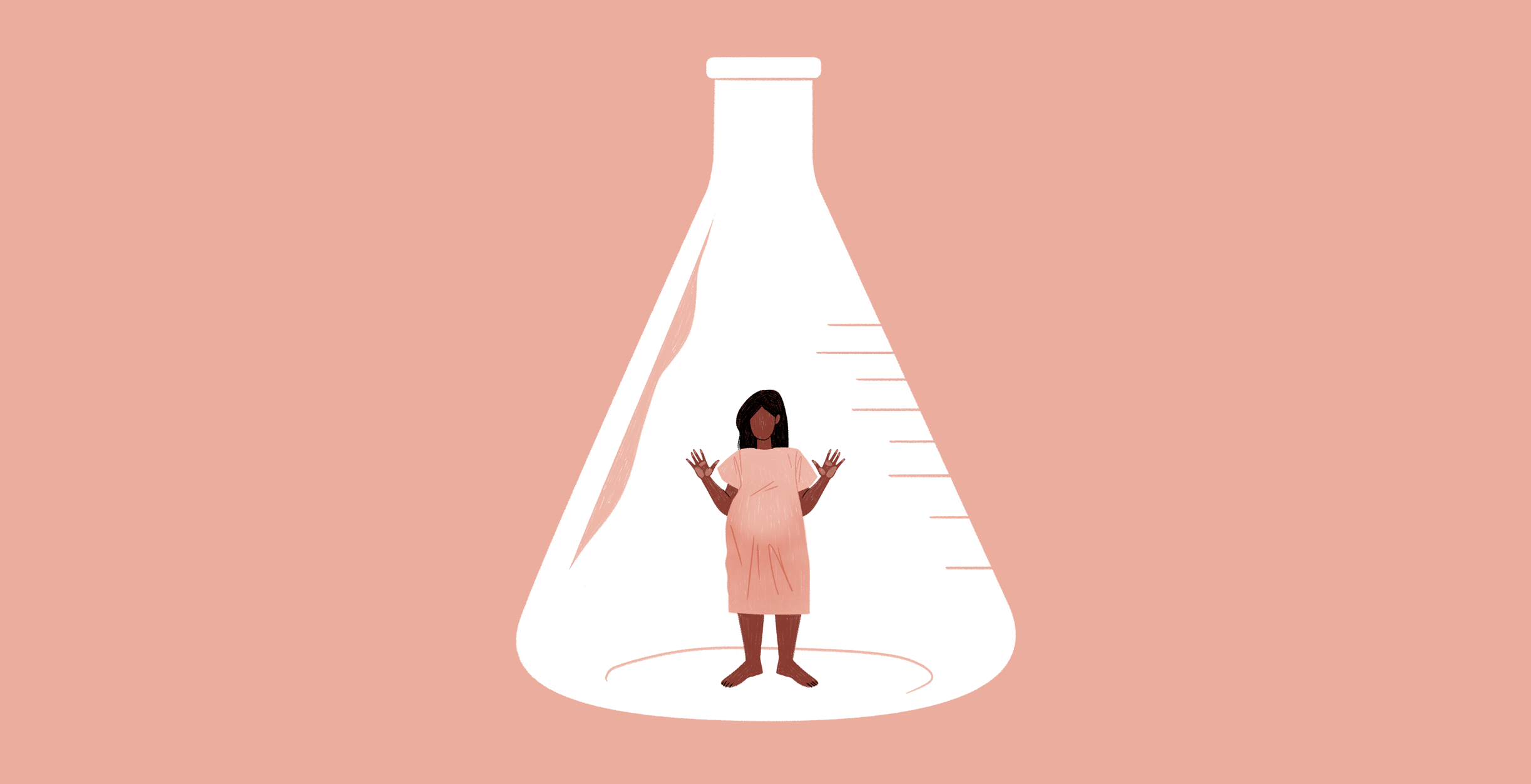
Bazaar tackles a number of current issues effecting women today. Connecting with the audience and giving the oft-conceptual writing a contextual visual was of utmost importance – illustration was the most impactful way to showcase the topics.
A palette, style, and system was created to help with the frequency of content being created, and concepts are always plotted out carefully. Illustrations are used with every article, allowing Bazaar to have a strong visual presence in the op-ed space.
Illustrated by Erin Lux

RED
1. The Catholic Church Has No Moral Argument on Abortions, 2. Women Are Afraid Men Will Murder Them, 3. What Will Actually Happen to Trump?
PINK
1. Why It's Impossible to Be a Likeable Female Politician, 2. The Benefits of Privilege: Being Rich and White Is Proof You Must Be Good 3. Anti-Abortion Activists Are Still Defending Forced Birth with Debunked Science
▾ Editorial Design, Motion, and Video Direction

Visual Design by Perri Tomkiewicz and Moira Gilligan ♥ Motion Design by Aaron Halevy ♥ Illustrations by Erin Lux ♥ Creative Direction by Nick Neubeck ♥ Front End Design and Development by Artem Artemov ♥ Production by Oona Wally